
Microsoft have posted an insightful article regarding their decision to add a Microsoft Office-style ribbon to the File Manager toolbar.
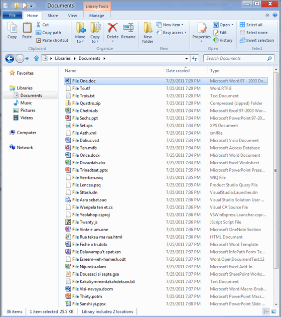
As usual, Microsoft go into some detail as to why this choice has been made. The article describes the most commonly used file buttons, in order, as paste, properties, copy, delete, rename, refresh and cut. These will now be shown in a large bar across the top in five categories – File, Home, Share, View and Manage.

Already aware of skepticism; it appears Microsoft are adding this as an additional method of getting to the already-available tasks; while also intending to add some new features. It can be seen from the screenshots, Microsoft may be removing the zoom feature and instead returning to the familiar Small Icons, Large Icons, Details and List that has been around since Windows ’95.
Some criticism has already arisen – the screen estate used purely for the ribbon is large, especially given some of the small screens for Netbooks. It appears Microsoft has chosen a deliberately narrow and long screenshot to help hide this.
It also features content tabs; which appear a useful addition to a new user:


But is Microsoft targeting the wrong people with this move? Surely most existing Windows users will shy away from it? I suspect many of us hope this will be an option.
Naturally this has ramifications for user interfaces on websites too. With Google Analytics and Heatmap software such as ClickHeat (open source, GPL); it’s easy to see which features your visitors are using most – but – like Microsoft, be aware that a significant change can easily alienate your user base.
It has also been announced that the new Windows 8 will feature a smartphone-style menu with panels; with (it seems) the normal ability to run software but with a smaller footprint of the Windows interface; improving battery life and speed. The rest of the interface will appear (or may even) be a separate application. This sounds very similar to the window manager system in Linux, and could be a good move to having a faster, stripped-down OS with the remaining features loaded on demand.
Full article on the ribbon can be found in this MSDN Blog post, and the new UI is described in Designing for Metro.
1 thought on “Microsoft to ‘ribbonise’ Windows 8 File Manager”
Comments are closed.